FRINGE BRANDING
Illustrator
Various Logos
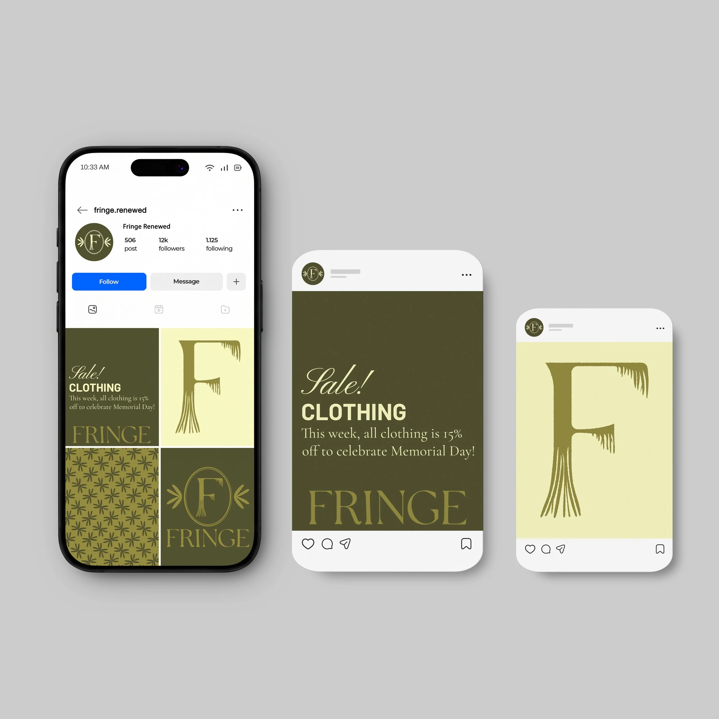
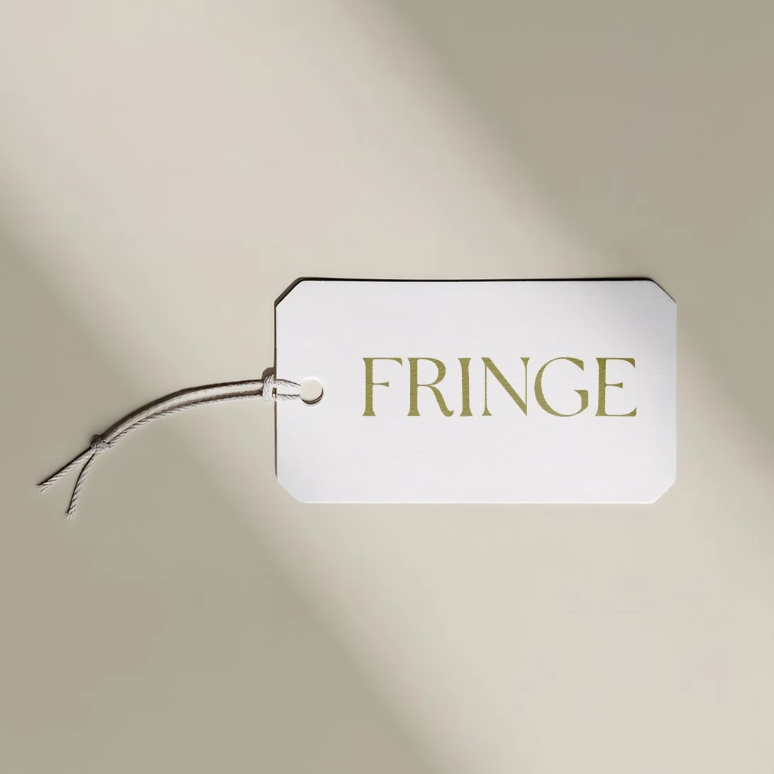
For this project, I developed a complete brand identity for a high-quality, thrifted clothing company called Fringe. The client envisioned branding that felt sustainable, organic, playful, refined, unique, and personal. To achieve this, I created an earthy yet vibrant color palette, selected complementary fonts, and designed textured logos that reflect the second-hand, textile nature of the brand. I also provided multiple logo variations to ensure flexibility across different formats and applications.
My process started with meeting up with the client to get to know her brand. I wanted to understand the mission, target audience, and message she was trying to communicate through Fringe. After meeting up with the client, I had a deeper understanding of Fringe and was able to move forward with research. I created mood boards containing lifestyle imagery, fonts, and textures as part of the research. I then moved forward with extensive sketching. Once I had some sketches that communicated Fringe’s story, I transitioned to my computer, where I brought the sketches to life using Illustrator and InDesign. From there, I refined them until I got Fringe’s official branding.
To emphasize the textile and second-hand nature of Fringe, I chose to add texture to the logo, which is reminiscent of fabric. Along with that, the earthy green tones and yellows signify the recycled and sustainable nature of the brand.